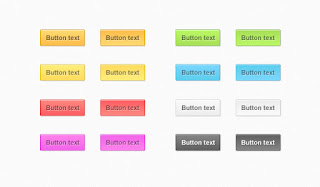
Buttons are very essential for any blog and they make blog beautiful. There is no option for adding buttons in Blogger. But its very easy to make your own button in Blogger for different purpose like download button, info button, submit button etc.
Here is a list of animated buttons that you can add in your blog to make it beautiful.
Pressed Effect
Ripple Effect
CSS code of this effect:-
Animated Hover Button
CSS code for this effect
If you want more buttons then you can leave your comment below and I will add some more cool button effects in my other post.
Here is a list of animated buttons that you can add in your blog to make it beautiful.
Pressed Effect
- In blogger post copy and paste this HTML code in HTML mode.
<button class="button">Click Me</button>
- Now paste this code in
.button {
padding: 15px 25px;
font-size: 24px;
text-align: center;
cursor: pointer;
outline: none;
color: #fff;
background-color: #000;
border: none;
border-radius: 15px;
box-shadow: 0 9px #999;
}
.button:hover {background-color: #333333}
.button:active {
background-color: #ccc;
box-shadow: 0 5px #666;
transform: translateY(4px);
}
Ripple Effect
CSS code of this effect:-
.button {
position: relative;
background-color: #191919;
border: none;
font-size: 15px;
color: #FFFFFF;
padding: 20px;
width: 150px;
text-align: center;
-webkit-transition-duration: 0.4s; /* Safari */
transition-duration: 0.4s;
text-decoration: none;
overflow: hidden;
cursor: pointer;
}
.button:after {
content: "";
background: #4C4C4C;
display: block;
position: absolute;
padding-top: 300%;
padding-left: 350%;
margin-left: -20px!important;
margin-top: -120%;
opacity: 0;
transition: all 0.8s
}
.button:active:after {
padding: 0;
margin: 0;
opacity: 1;
transition: 0s
}
Animated Hover Button
CSS code for this effect
.button {
border-radius: 4px;
background-color: #191919;
border: none;
color: #FFFFFF;
text-align: center;
font-size: 15px;
padding: 20px;
width: 120px;
transition: all 0.5s;
cursor: pointer;
margin: 5px;
}
.button span {
cursor: pointer;
display: inline-block;
position: relative;
transition: 0.5s;
}
.button span:after {
content: '»';
position: absolute;
opacity: 0;
top: 0;
right: -20px;
transition: 0.5s;
}
.button:hover span {
padding-right: 25px;
}
.button:hover span:after {
opacity: 1;
right: 0;
}
If you want more buttons then you can leave your comment below and I will add some more cool button effects in my other post.


your Slider About Information Is A very Good Nice Work Bro..
ReplyDeleteAnd Thank You
https://thebrandcollection.blogspot.com/
great post it helps me alot in building my own sawing website
ReplyDeleteIts help me a lot to make my Technology site
ReplyDeleteMore Look Thanks, Man!